

Written by Lukia Yuanshu Xu
Storytelling has always been a center of PR and marketing, in fact, it is sometimes more important to a business than the product or service. A well-crafted and visually appealing story could help your business catch the attention of customers, but to further convince your audience, you will need to build some credibility with data.
Being a data-driven storyteller is not just for content marketers, but for nearly everyone who needs to present to clients, superiors and even just in class. The numbers always speak for themselves.
To be a data-driven storyteller you don’t need a degree in statistics or be a maven in data analytics, as someone whose job is to tell the story, you just need to know how to interpret and present the data in a right way. So here are some tips of becoming a savvy data-driven storyteller and some resources you can use, mostly free.
- Think about your audience.
Like all marketing/PR campaigns, you always want to keep audience on the top of your mind. Make sure you know what their “pain points” are and how your products/services could speak to their needs. Your goal at this stage is to come up with a question that your story will address. If your question has a quantifiable dimension, it is more likely to make up for a good data-driven story.
- Find the right data.
By “right data” I’m not just talking about the data that make your story compelling, but the data that are credible and solid enough to convince your toughest client. That means you need to be careful about the sources of data, Wikipedia is not allowed as data source in thesis for a reason.
If you want credible data, here is a list of some common sources:
- Public data sites: government databases, state agency databases, WTO/IMF databases etc.
- Research institutes: Pew Research Center, Forrester Research etc.
- Reports from large consulting firms: McKinsey, BCG, PwC, KPMG etc.
- Publications: Academic journals etc.
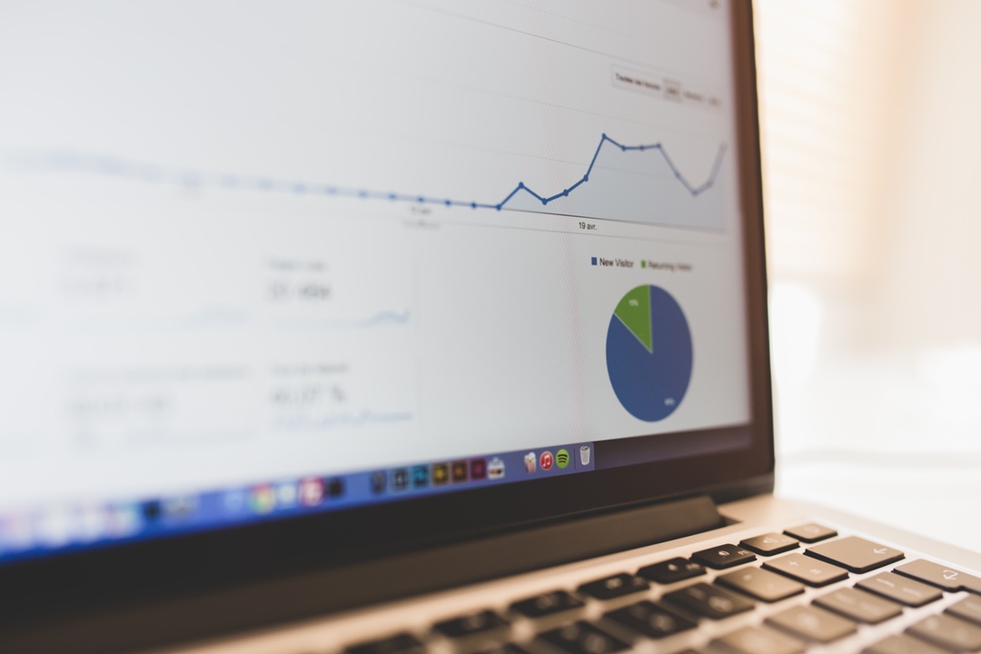
- Present your data.
If good data make up 40% of a successful story, then visualization is 60%. Human beings are visual animals, especially in this world full of distractions, people will only pay attention to the catchy ones.
Using infographics is a good way to convey your message. The longer layout allows one to actually tell a story from the beginning to the end, keeping your audience on hook before getting bored of all the numbers.
Some tools to generate infographics are: Adobe Illustrator, Powerpoint/Keynote, and online websites like infogr.am. If you like design or holds very high standard to your work, Illustrator would work to your best interest, it just takes more time to learn. If you don’t mind using other people’s design, online websites would be your go-to place. Personally I like Powerpoint, because it’s just so easy to use and also allows great room for creativity. A lot of designers actually use Powerpoint frequently. You can get Illustrator for free if you are from Annenberg, and most of the templates on infogr.am are free while some do cost a bit money.
An interesting way to present the data would be interactive, this works well for audiences who like to explore a bit, and honestly who wouldn’t like to play a little game? A software to help you realize this would be Tableau. I call it a “fancy Excel” because all you need to do is put your data in and choose a chart/graph. It works well even on large quantity of data, like thousands of tuples. And you can get a free student version on their website, otherwise it’s very expensive for entreprises.
With your USC account, you can take the courses on Lynda.com for free to learn these tools.
- Seek feedback before launch.
This sounds like cliche but a lot people will forget when they actually start working. You get excited about your beautiful masterpiece and you can’t wait to show it off to everyone. But before you do anything, be aware that you are too small a sample and your opinion is highly biased. Ask someone else for their thoughts, especially those similar to your audience, have a keen eye for design or have done this before, they might tell you this color should be lighter, that portions on the pie chart don’t match with the numbers, or it’s just not that interesting to catch attention. They will save you a lot of trouble and frustration.